To start i started to come up with different names for the brand i am creating for the website and pack that is to be sent out.


The idea behind the names was that sustainability is something that should be done, hence the 'do something' and 'design sustainability' 'D.S' this then relates to Jonathan Chapman who i talked about in my essay. The other name was 'never ending' because being sustainable is like something that is never ending, i then thought about a circle which has a line that is never ending, never ending i thought didn't work so i thought of other similar names such as 'viable', 'continual' and 'continuous'. I then settled with continuous, because sustainable design should be Continuous.
Initial logo ideas.

I then decided to look at different typefaces for the logo, looking at sans serif, serif and script fonts.

Within this list i think the top 2 are too bold and the 2nd from the bottom. I think the others aren't quite organic enough and are a bit boring.

I don't think these work well as a logo for sustainable design they are a bit too corporate, accept the bottom one which i think works well, it isn't boring and has a little something about it. It also has an organic look to it.

I like the top one here because again it works well with the subject of sustainability and it isn't boring.

having looked at script fonts i thought they didn't work well and maybe weren't serious enough like the previous 2 i liked. Also they look a bit confusing.

Having settled on the 2 typefaces i had courier in medium and also in oblique. I then used the tagline below to give it more context.
Generating logo ideas


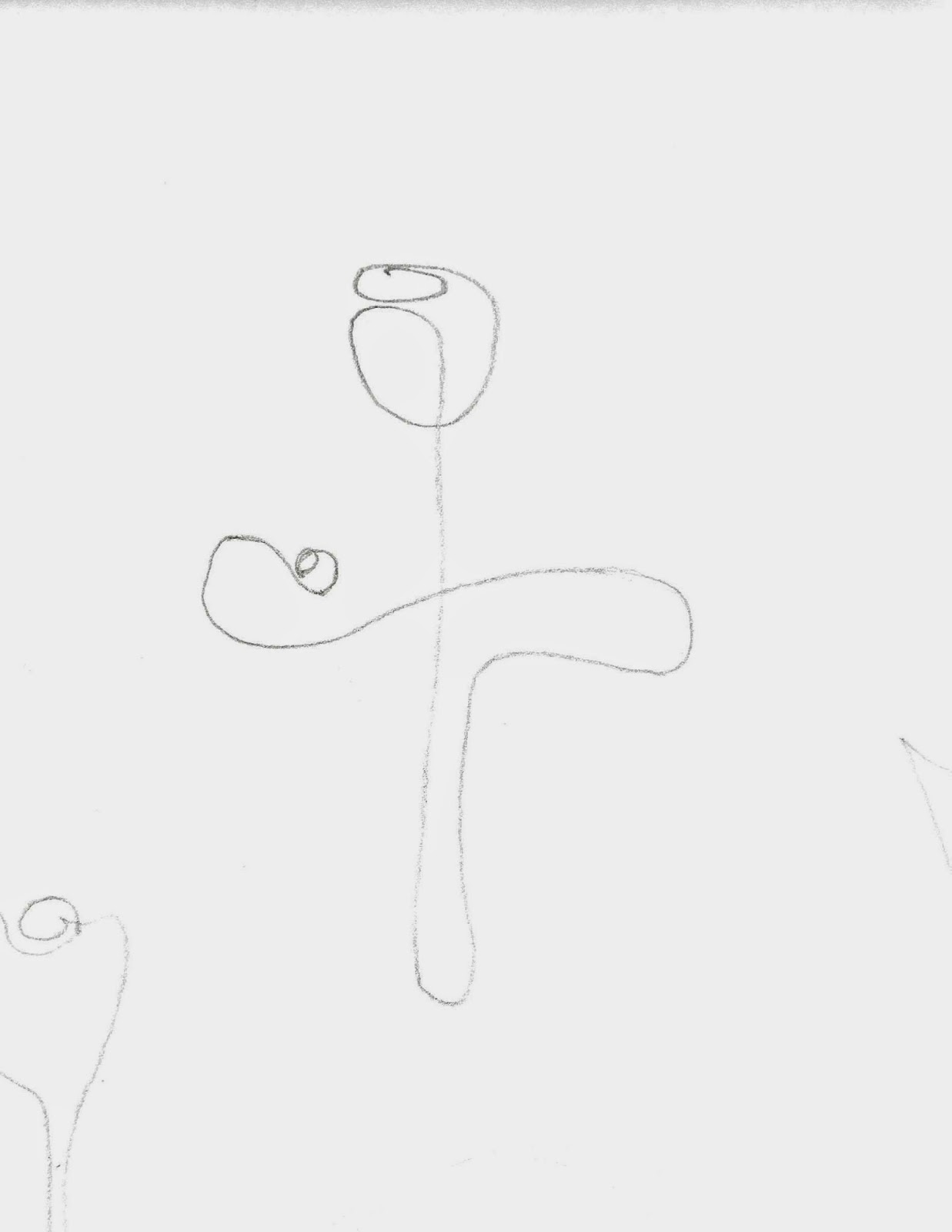
These are initial ideas of the logo and how it might look, because the name is Continuous i have looked at doing continuous line drawings, like the flowers which i think work well. I also looked into circles because thats a continuous line and i tried to link that with the C of continuous, i also did the same for spirals.
I then started to vectorise some of the logos i drew.


I felt like these weren't really working and that they looked a bit like the copyright logo so i started to draw the flowers that i had

I think the one above looks too much like a man showing how strong he is but the one below has worked really well.

These are other flowers i drew, but i don't think they are as organic like the one above, they also aren't continuous line drawings like the one above. Not only this but they look like the Irish 3 leaf clover the shamrock.


Final logo design

This is the logo with the 3 different typefaces, i think the top works best because it has capitals and so is that bit more serious but it isn't boring i also like the italics because it gives the sense of moving forward.


No comments:
Post a Comment